


When given her style options, our client chose the boldest concept, which surprised her since it was not the original direction she had envisioned for this project. She stated it expressed her vision in a way that could distinguish her brand.

During the design phase, we provided her with three style themes, two of which aligned with her original concept and one that was an alternative direction.
This technique can generate additional fresh new ideas for the overall design. The goal is to create authentic final products that are personal and unique to our clients.
Sometimes, clients need multiple designs appropriate for different applications.
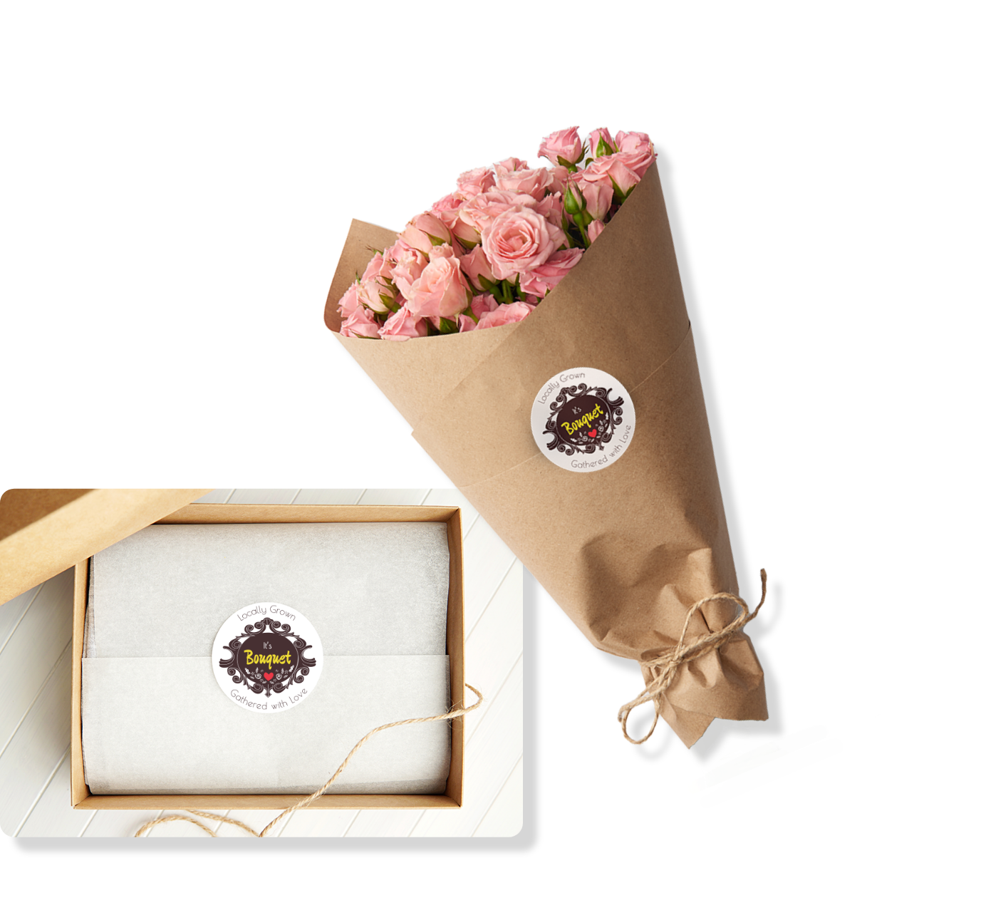
A limited-color logo is neutral enough to balance the many different colored flowers of a bouquet when used as a packaging sticker.
The bold color block was too intense for larger prints, removing attention from the name and smaller flower graphics.
The logo variation is lighter and bright, perfect for merchandise, providing a balanced look for business cards to large-print signage applications.

